Displaying occurrences in clusters
Our primary researcher wanted to demonstrate our project to INBio, a Costa Rican NGO involved with biodiversity research and conservation. So we branched our codebase, recentered the map on Costa Rica, and imported the species data INBio gave us.
INBio’s dataset was quite small: the most observations for a single species was 700 for Automeris zugana, a moth with prominent wing eyespots that you can see here getting eaten by a tailless whip scorpion, which is not actually a scorpion (or even a whip scorpion).
This meant I had a perfect opportunity to look at displaying observations on a map. This is easy; just put a dot at the x/y location of each observation.
For example, here’s a map of Costa Rica with occurrences of automeris zugana drawn on as little circles:
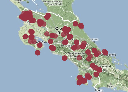
You can see that this moth has been found across more-or-less the whole country, with a more dense area in the north-western corner. But with this view, you’re missing information — can you tell where the second most dense area is?
This problem, where lots of things on a map cover each other up, can be solved by bunching the items together into clusters. Clustering also helps when there are so many items on the map that sending each one from the server to your browser takes a long time.
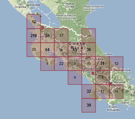
Here’s a different rendering of the same observations, but this time I’ll cover the map with squares, and write the number of observations in each square:
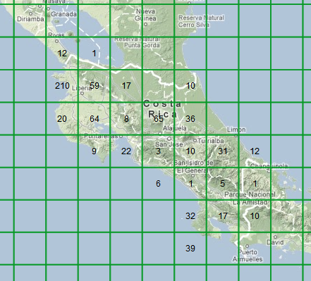
If you spend a few seconds looking at the numbers, you can see that north-western corner definitely has the lion’s share of observations, with a 210 square and a couple of 60-ish squares, and there’s another 60-ish block in central Costa Rica too. That’s important information you weren’t getting from the dots. But the map is all ugly now, with a big grid over it. Maybe I should make all the grid lines fainter, but if we say it’s okay to make them a bit less visible, why shouldn’t I make them completely invisible?
To make a good decision here I need to answer this question:
What information, exactly, are the grid borders communicating to the viewer?
The answer I came up with is this: the grid lines show you the area the count applies to; the number in the middle of a grid square is the sum of observations inside the square’s borders.
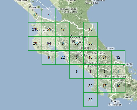
So, I’ve decided that the user needs to know where the border is for each number’s area. But that’s not important for the zeros (which I already show as blank, instead of writing “0” on the screen). So I tried not drawing the borders of empty squares.
That’s still not great, but it’s a lot easier to look at. Secondly, most people aren’t very good at picking out of high and low sections in a grid of numbers (accountants and other people who look at spreadsheets a lot are better at that than normal people like you and I).
I tried dividing up the numbers into high, medium and low terciles, and formatting them differently:
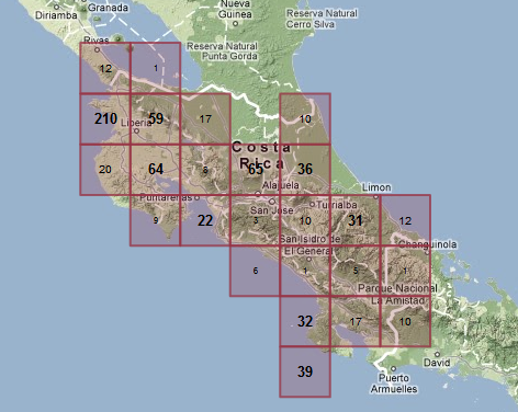
I also changed the colour, so it didn’t interfere with the green map background as much. This does a pretty good job of showing where the big clusters are.
Finally, the idea of showing a cluster square for just a few occurrences seems a bit odd, so I added a cutoff so that if a square would have fewer than four observations they just show up as dots, and I don’t draw the square.
Okay, so that clustering technique is ready to show to my customer. I also want to work up an alternative clustering technique or two for comparison’s sake.
I haven’t shown zooming behaviour here, but it’s another interesting problem that I will try to cover in a later post.
blog comments powered by Disqus
